Found why buyers dropped out of checkout, and what to change, in two hall tests
After Beeline launched its credit broker, buyers started disappearing at the delivery step, after Beeline had already paid to score them. Two hall tests with real customers showed what order the steps should go in, and what the Next button was costing us.
- My role
- Ran the research: hypothesis, prototypes, hall tests, analysis
- Team
- Customer experience (CEM) team, product team
- Method
- 2 hall tests, 23 and 12 respondents
- Platform
- Shop Beeline, mobile checkout
We were paying to score people who then left
At the end of 2022 Shop Beeline launched a credit broker, and it was making money. But the funnel showed buyers dropping out at step 3, delivery, after we had already paid for their credit scoring.
Hypothesis: if we swap steps 3 and 4, so buyers choose their credit offer before delivery, sales will go up.
A hall test with real Beeline customers
With the customer experience team, I recruited 23 real Beeline customers who had bought electronics online, filtered by gender, age and income. Each placed an order in two checkout prototypes: the current one and one with steps 3 and 4 swapped.
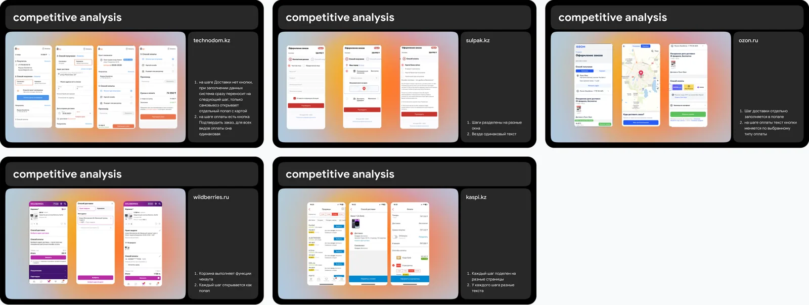
Before designing, I benchmarked checkouts at Technodom, Sulpak, Ozon, Wildberries and Kaspi.
Buyers want to pick the offer first
20 of 23 people, 86%, preferred choosing the payment offer before delivery. Only one preferred delivery first. As one respondent put it: “Suddenly I won’t find anything suitable, and then I won’t need delivery.”
Recommendation: put offer selection before the delivery method.
The Next button was the bigger problem
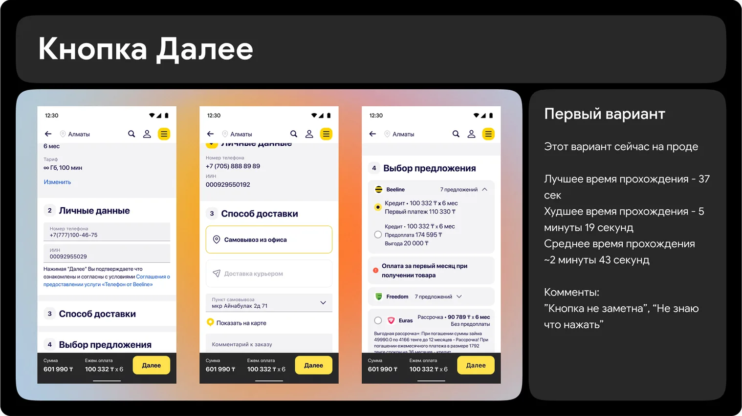
17 of 23 respondents didn’t understand how to complete a step. The generic “Next” button didn’t tell them anything. So I ran a second, timed hall test with 12 people across three age groups, comparing the current Next button with a version where every step has its own button text.
- Current “Next” button: average 2 min 43 s, worst 5 min 19 s. “I don’t know what to press.”
- Step-specific buttons: average 1 min 37 s, worst 2 min 3 s. “Everything is obvious.”
Offer first, and buttons that say what they do
Two changes went to the product team: move offer selection ahead of delivery, and replace the generic Next button with step-specific labels, keeping a floating button only once an offer is chosen. A small-looking problem turned out to be the one costing us the most.

Research earns its keep when it finds the problem nobody was testing for. We came to reorder steps and left fixing a button.